

Offgrid is an outerwear brand based in Minneapolis, Minnesota that creates sustainable gear and drinkware for every outdoor enthusiast.
Why an outerwear brand?
This was my chance to work on a project that was important to me and held value. I chose an outerwear brand because I’ve felt a connection to the outdoors since I was a kid. Growing up I was usually the one digging in the dirt and playing kickball with my neighbors.
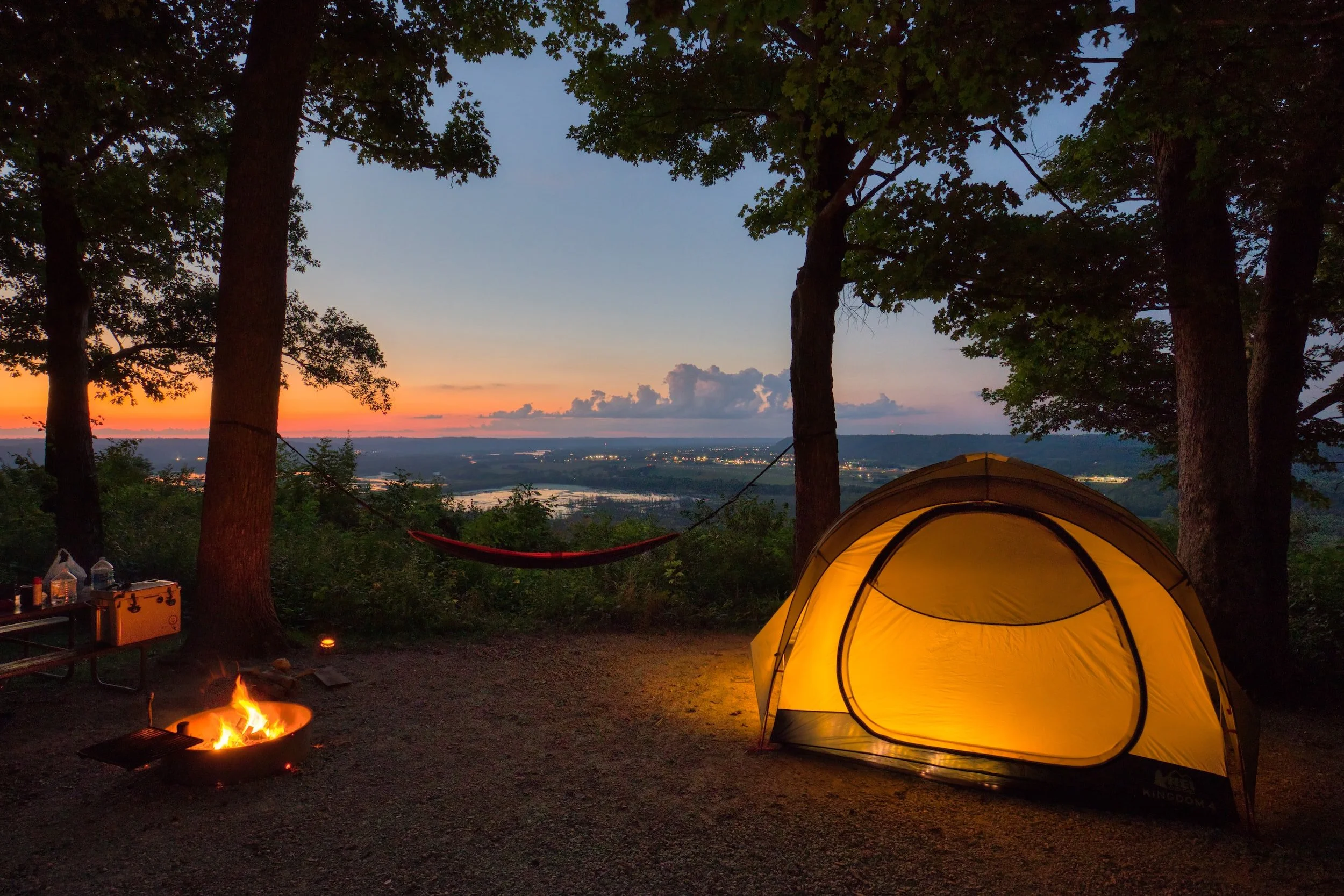
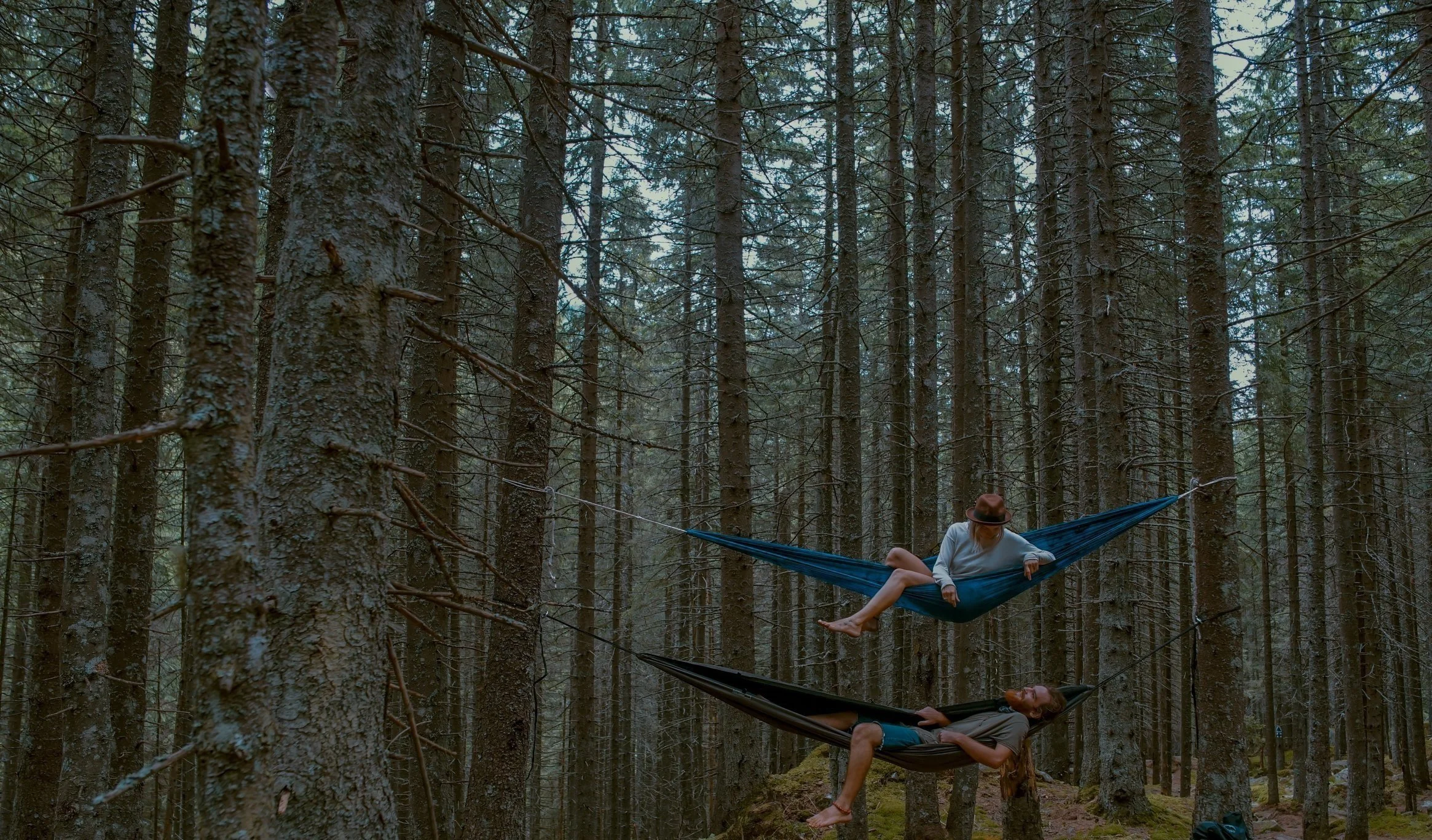
As I grew older my love for nature didn’t fade. I surrounded myself with like-minded people, who loved campfires, cliff jumping, hiking, and camping just as much as I did.
My inner spirit comes from the outdoors.
I do believe that human beings are supposed to stay connected with nature, and all it has to offer. As technology advances, the world is becoming far more industrial, and the balance between humans’ existence and all the earth has created is shifting.
Although I’m a graphic designer, I still care for the environment and everything it offers. I think it’s important to protect it and be a part of it. I want to create work that has meaning, and design is one of the best ways to spread awareness on important subjects. People are drawn to beautiful packaging, branding, and products, so being able to create a project that is centered around the outdoors was an exciting opportunity for me. I hope I can share the beauty of the natural world, and have people appreciate it just as much as I do.
Concept and Logo
During the research stages, I wanted the logo to be simple and immediately comprehendible. I looked into other outdoor brands, and drinkware brands, along with designs and icons that were simplistic. I created style tiles of big type and simplified icons for my branding.
I also looked into the names of brands and researched words that could represent the idea I was trying to get across with an outerwear brand. I chose OFFGRID because it represented the adventurous side of outdoor enthusiasts. Going Offgrid is a daring experience that nature lovers and hikers dream of doing. I wanted to create a brand that represented this feeling.
Offgrid uses bold type and incorporates arrows as icons to represent compass directions. The G is in the center of “Off grid” which is the main focal point of the logo. It’s a perfect circle, with the arrow in the center of the G, to form the letter but also give off the impression of an arrow. The bars of the other letters in “Off grid” are open, to represent dashes from the arrow. This can give the impression of movement and is a way to visually represent going off-grid. Whether it’s envisioned as the dashes on a road you’re traveling or a map of a route you’re taking.

Deliverables
Insulted bottles
Plastic recycled bottles
merch (Crewnecks & Beanies)
Hiking gear essentials
website
ecommerce
social media
environmental advertising
Products
and Icons
I created various icons to represent different products in the brand, along with navigation for the website. Each icon has a unique representation and was made to be cohesive and fit within the identity of the Offgrid branding.
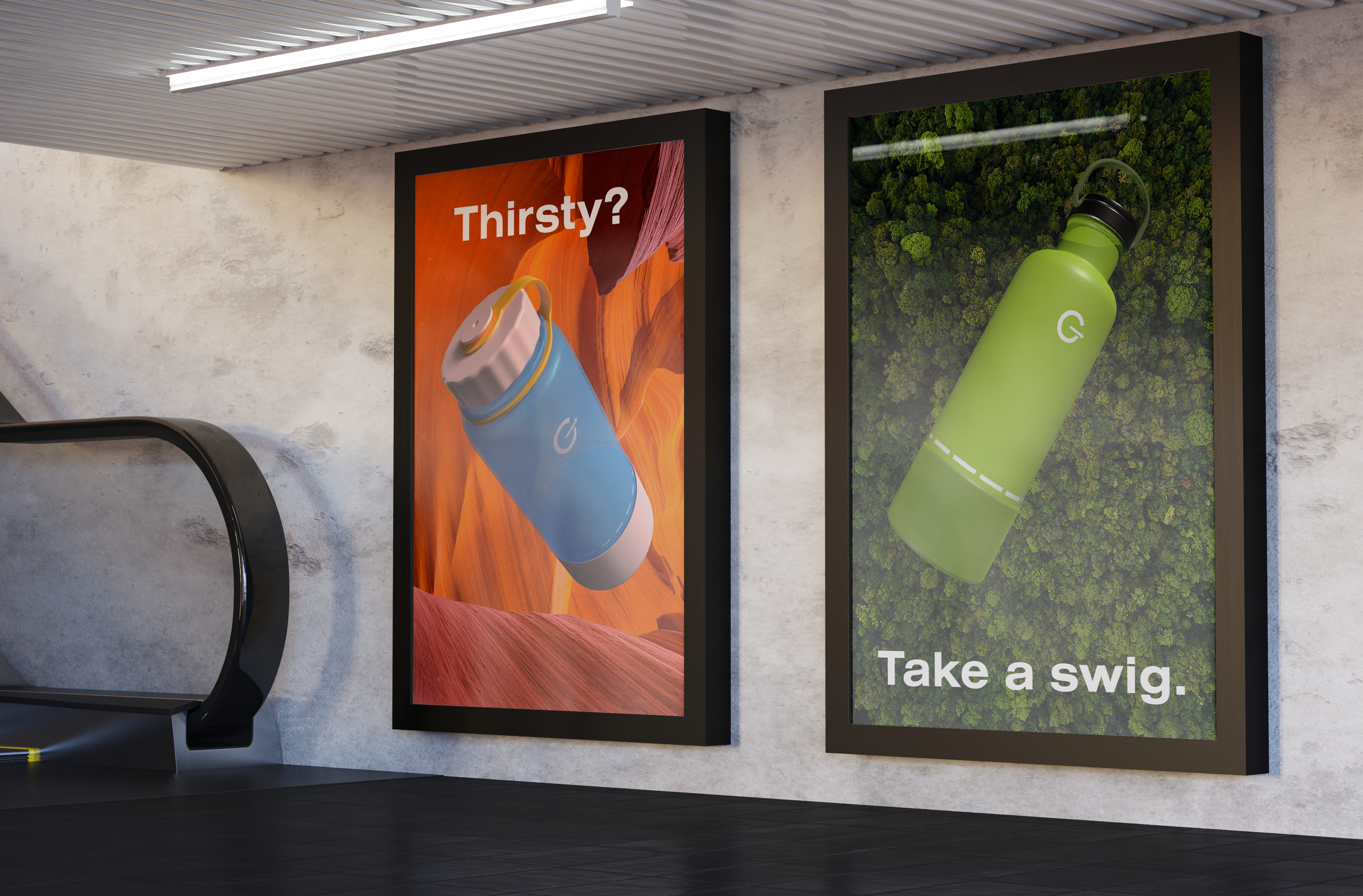
Thirsty?
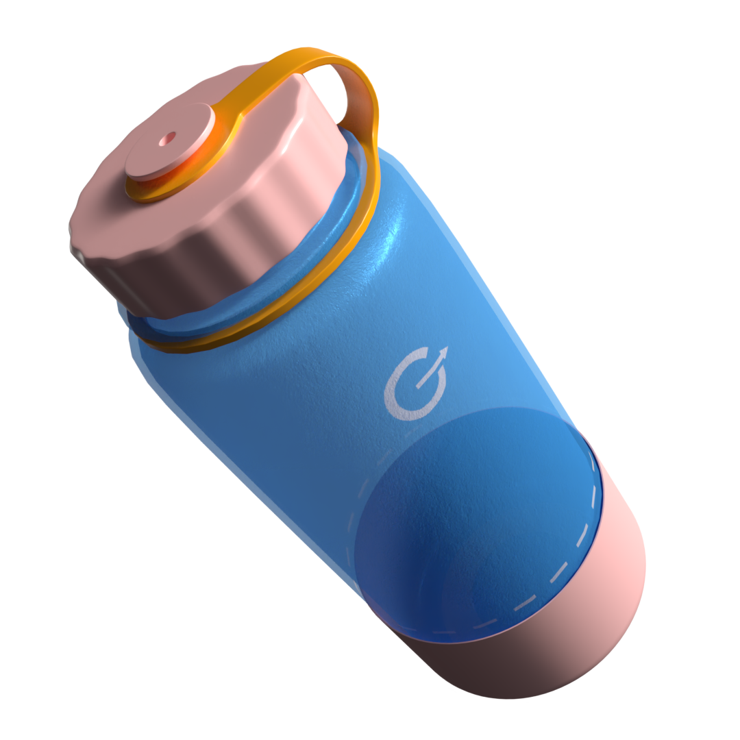
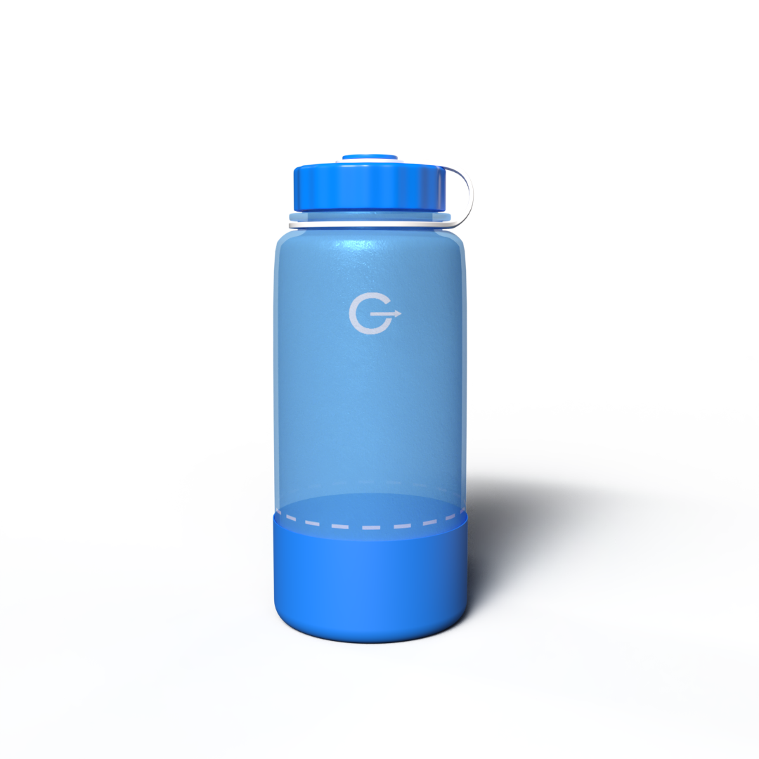
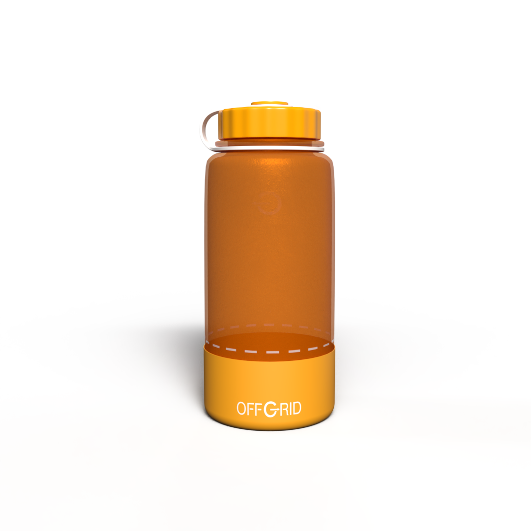
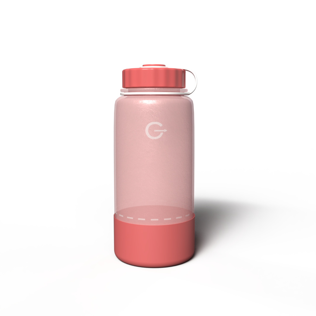
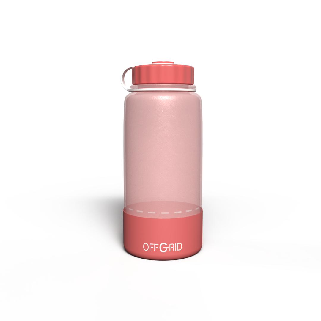
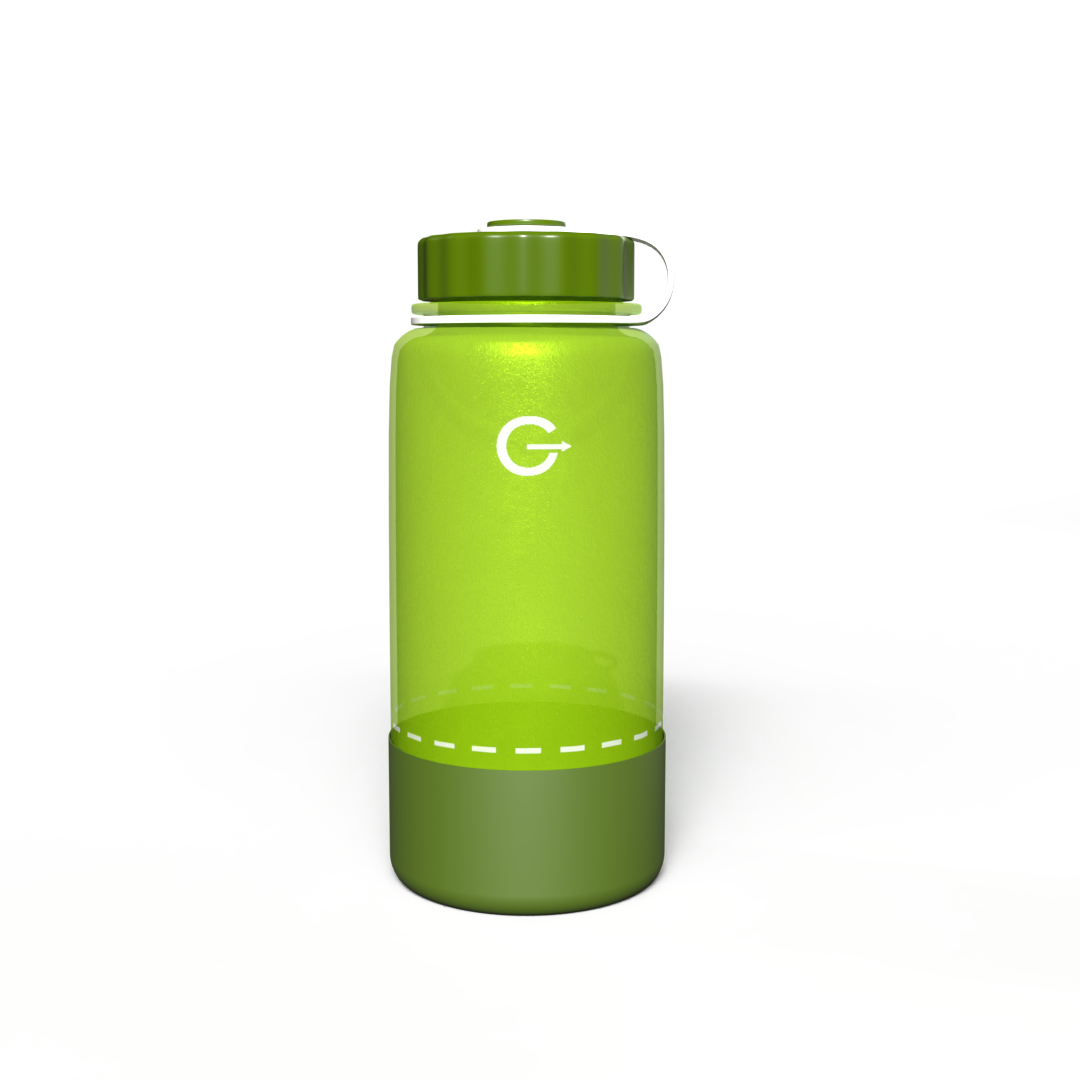
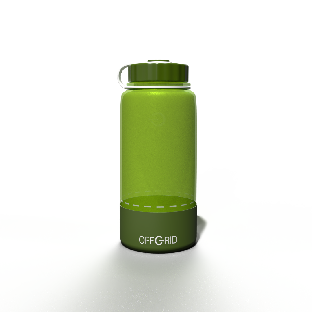
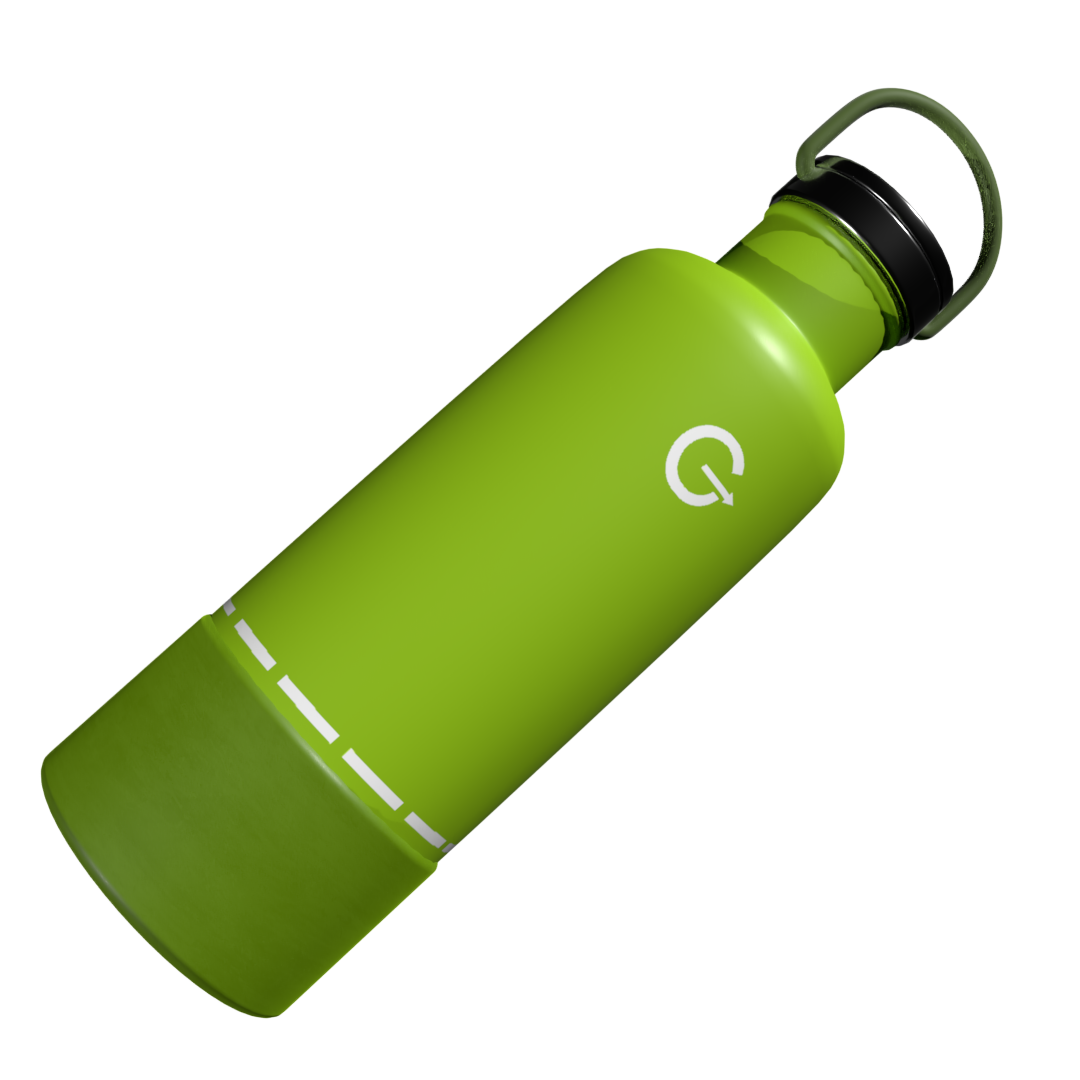
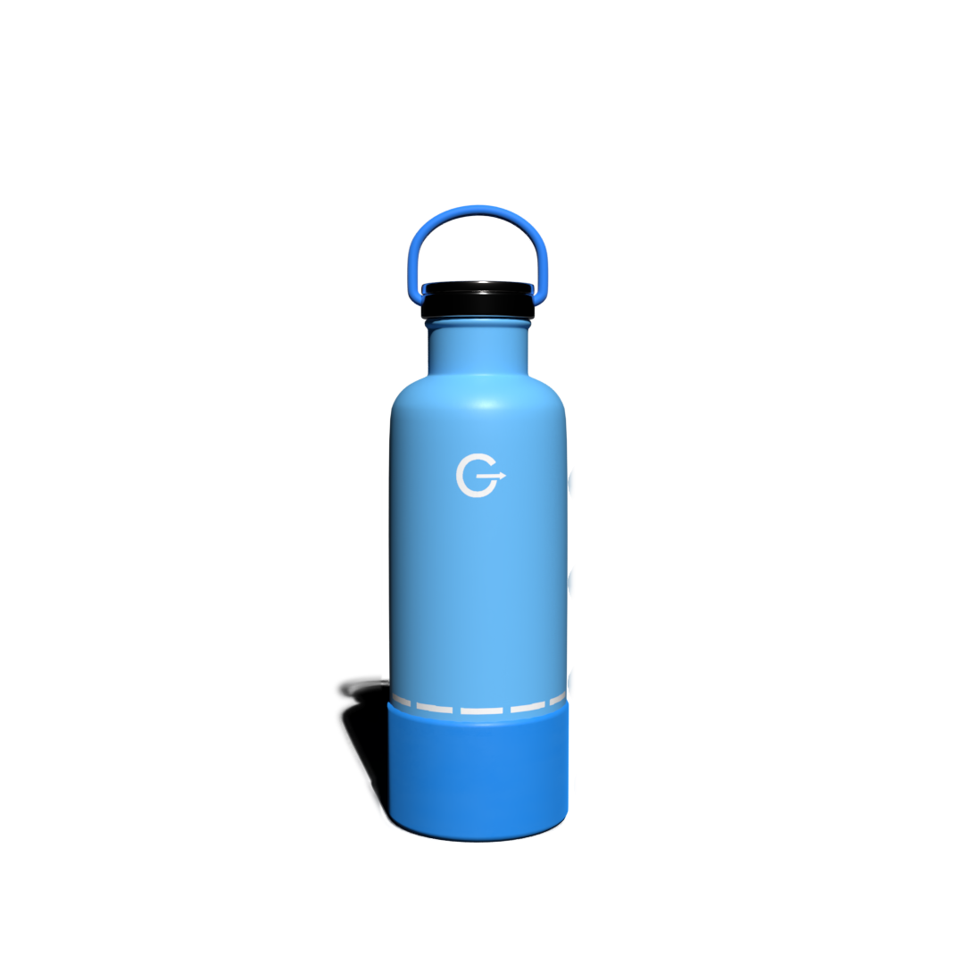
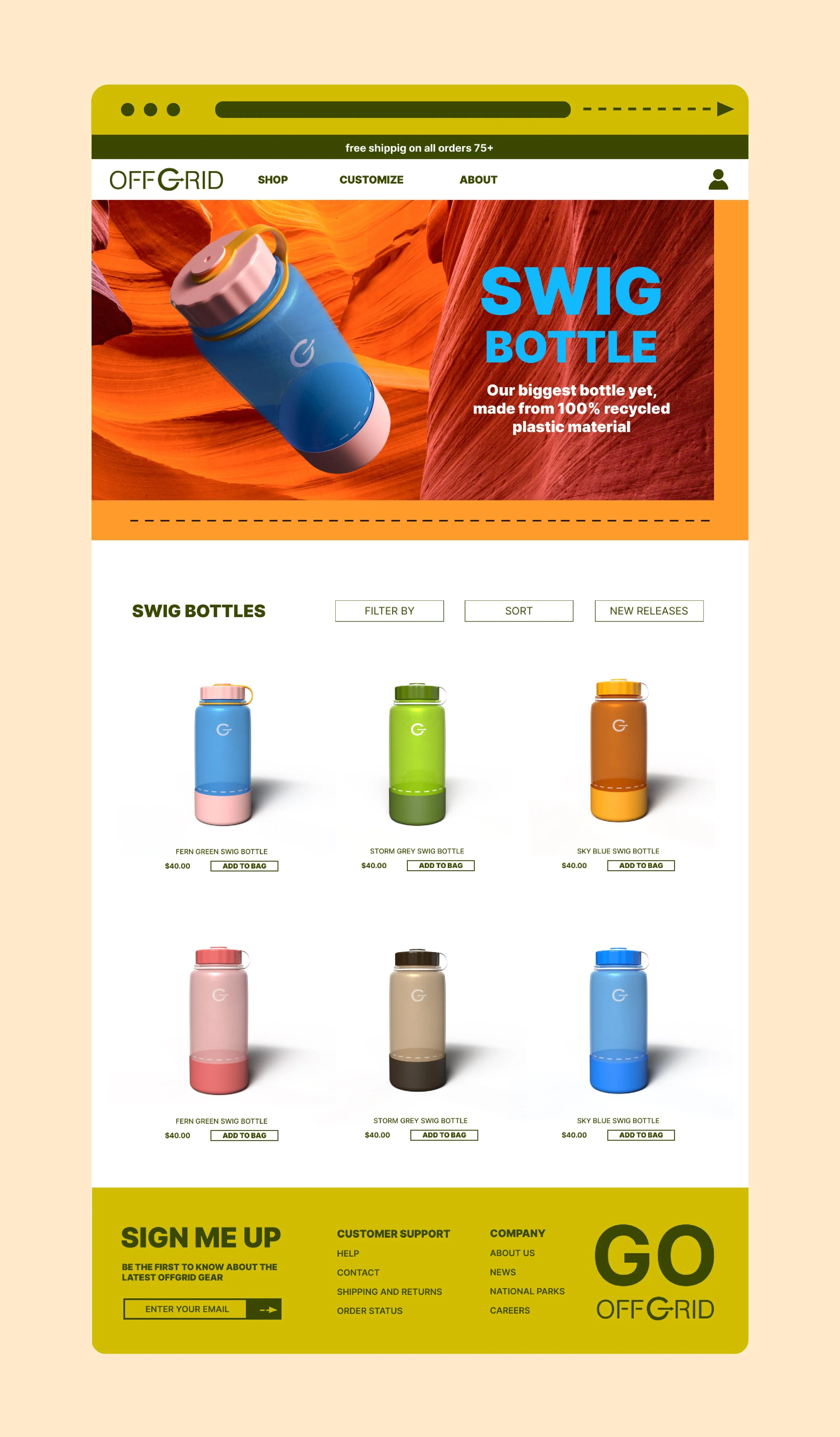
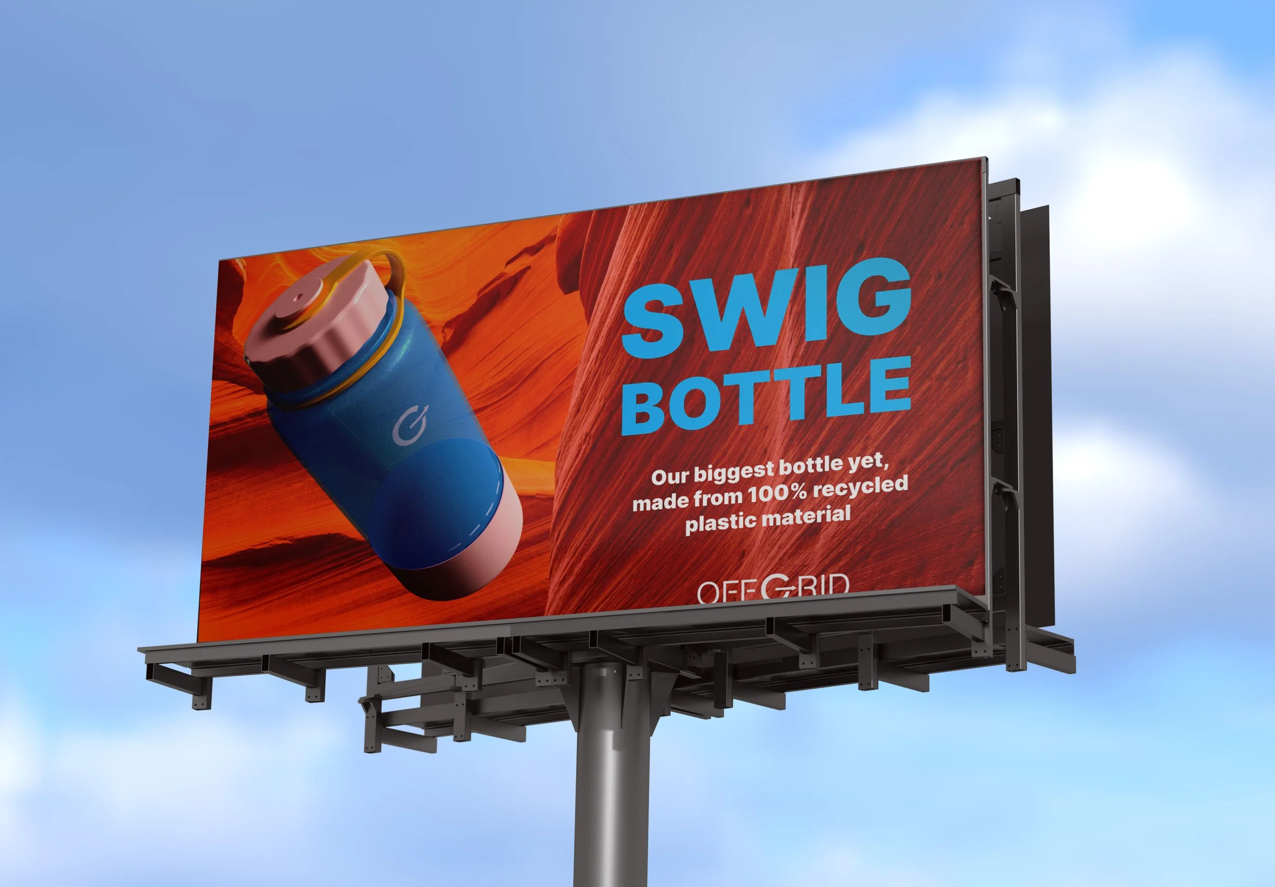
Swig Bottles
For the swig bottle, I wanted it to look like it was made from recycled materials. I used a plastic base material for the body and adjusted the surface roughness, shine, and opacity. I then used plastic for the lid and lid container, and rubber for the base.
I was able to adjust the colors, to create bright products for the brand, and used Photoshop to overlay logos and icons onto the bottles. Once the object was completed, I had to set up lighting from the environmental lighting in the 3D space, as well as spot lighting for the front and back of the bottle. This ensures successful lighting of the product when rendering, and avoids any glares, shadows, or funky colors.
Take a swig.
Offgrid Bottles
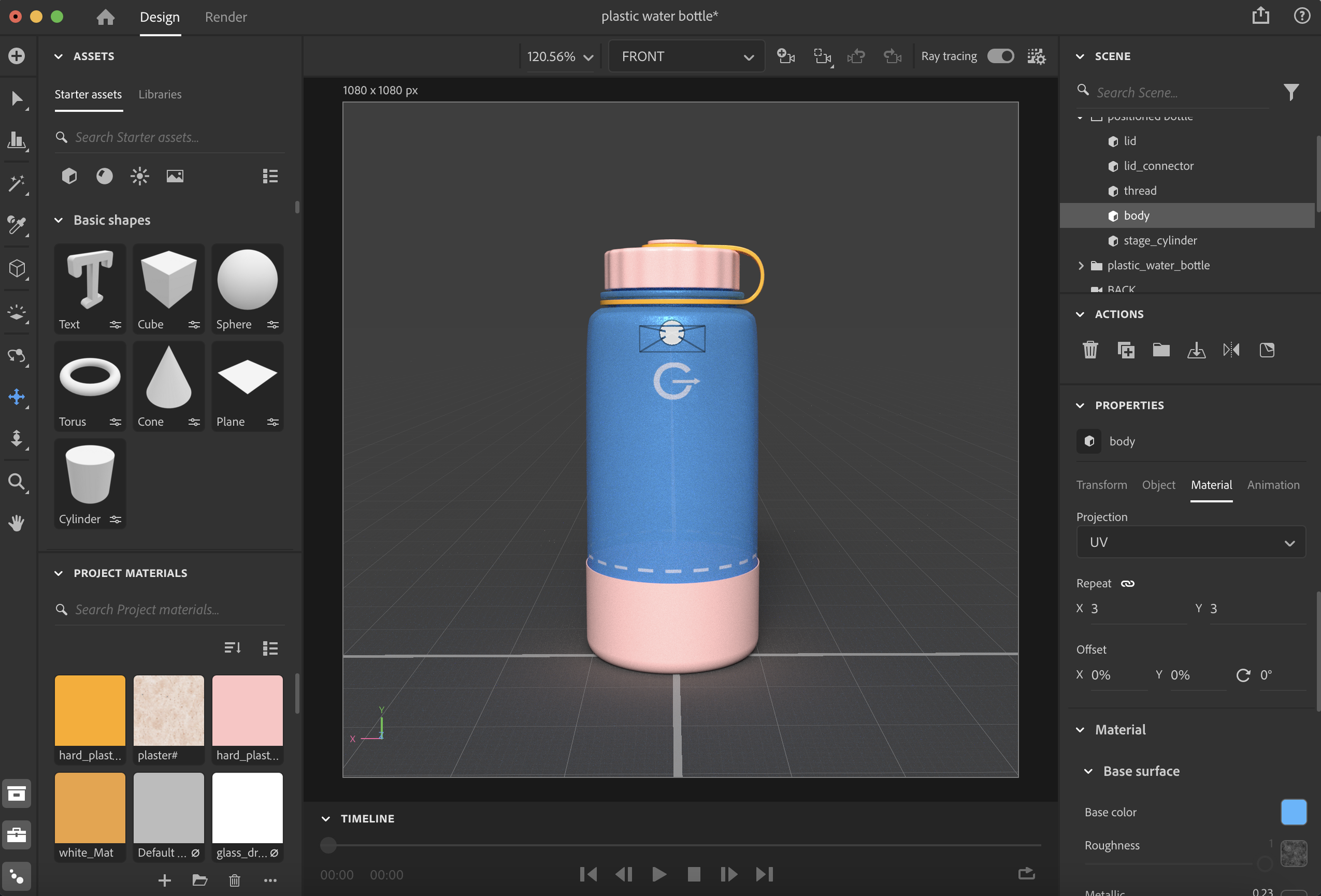
Bottles were a main deliverable when creating Offgrid, and I created two types using adobe stager. By combining shapes and materials, I could build realistic bottles in a 3D space.
When using adobe stager, I could create the product how I wanted it to look. I enjoy this level of flexibility when I want to bring an image to life.


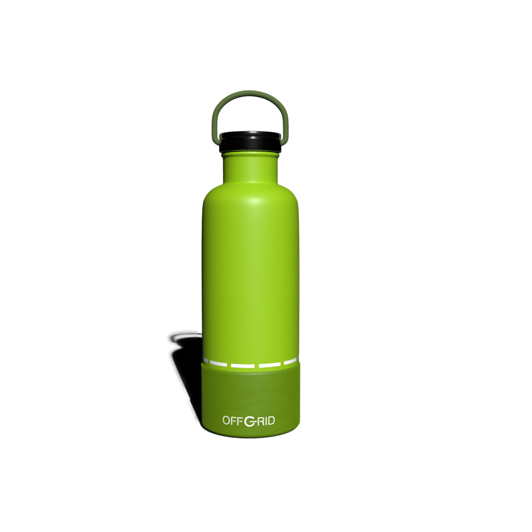
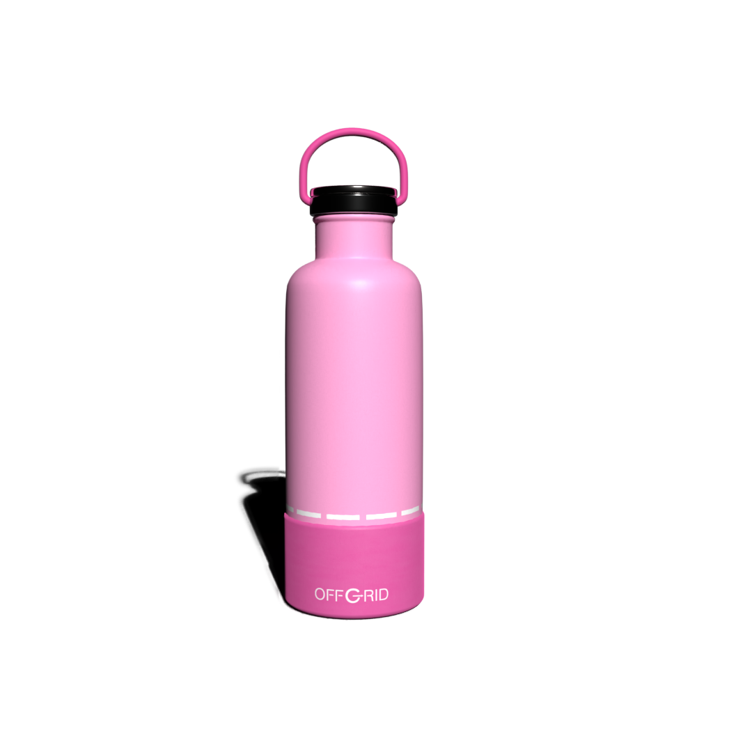
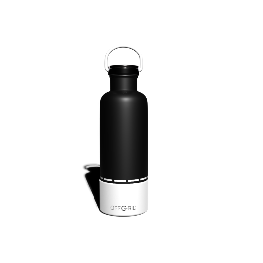
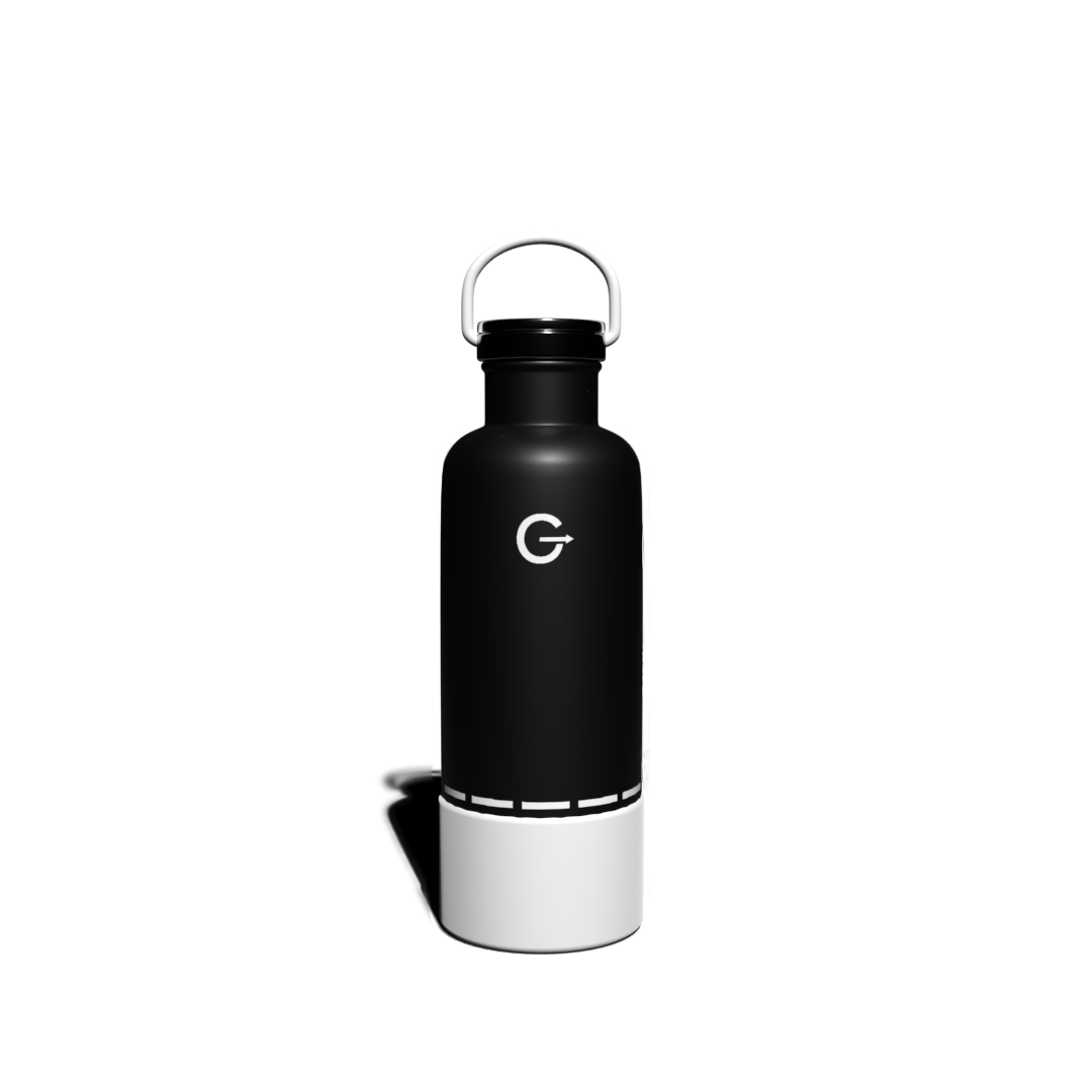
Insulated Bottles
For the insulated bottles, I wanted their purpose to be obvious to the consumer. They’re supposed to be insulated, and keep your beverage at a certain temperature, whether that’s hot or cold.
In Adobe Stager, I used a painted matellic as the material for the body, and adjusted the shine, opacity, and roughness to achieve the look I was going for. I then used regular metallic for the cap and screw, and rubber for the handle and base. The use of materials was a successful way to show that these bottles have a purpose, and that they’re insulated.
I also used photoshop to overlay the offgrid logo and extra icons. Once the product was complete I used environmental lighting techniques, and adjusted the spot light to capture successful images. Metalic material can be tricky with lighting in stager, it can look okay in camera view but once you start rendering their can be glares and discoloring on the object. By using ray tracing and rendering the images, I was able to achieve correct lighting for the insulated bottles.


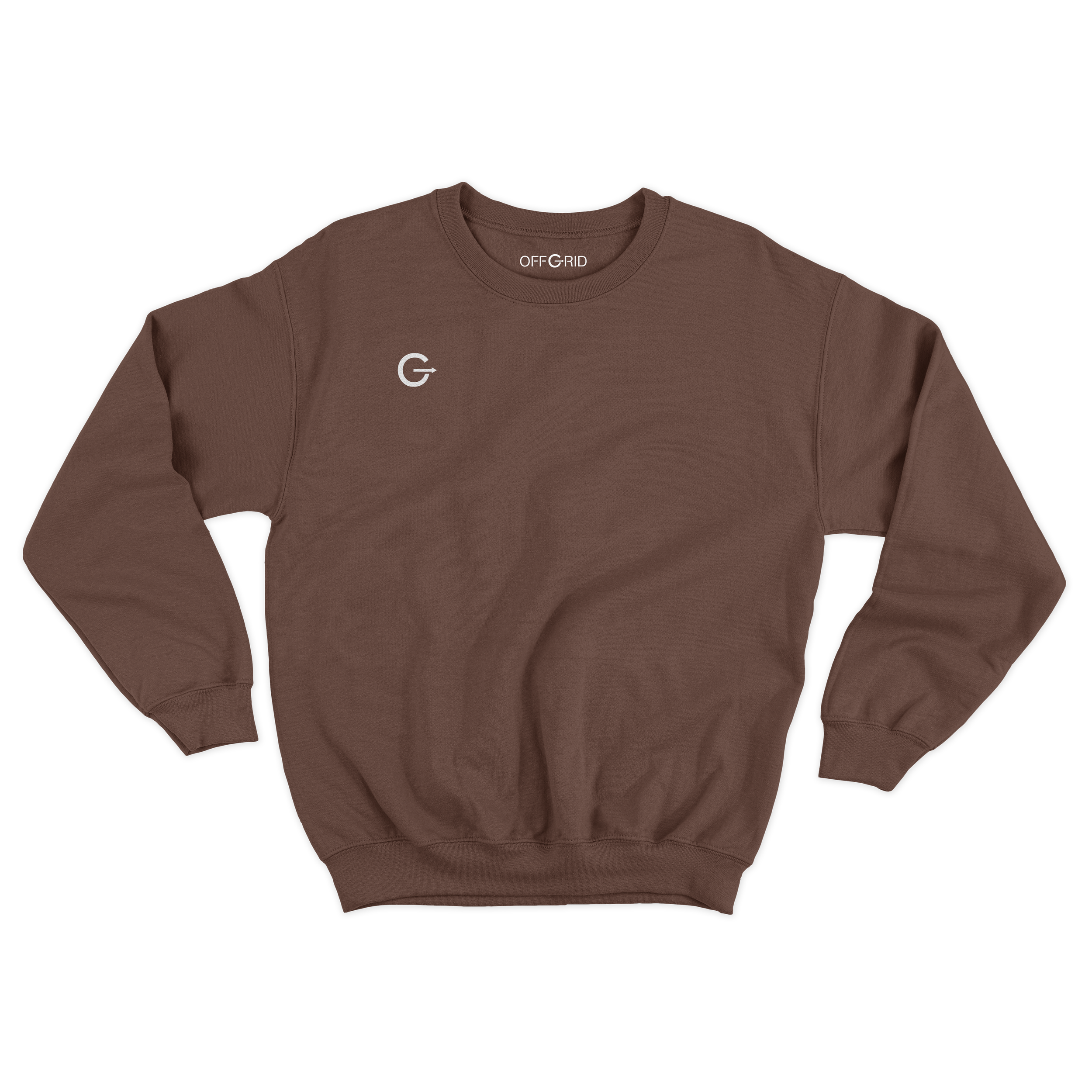
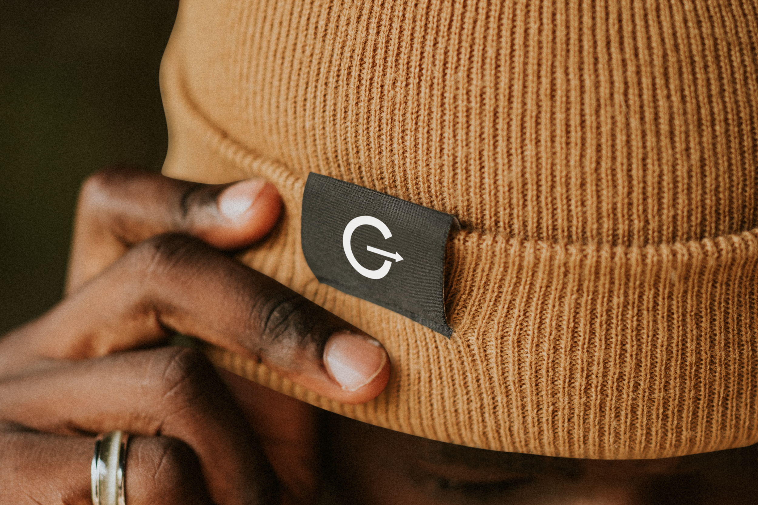
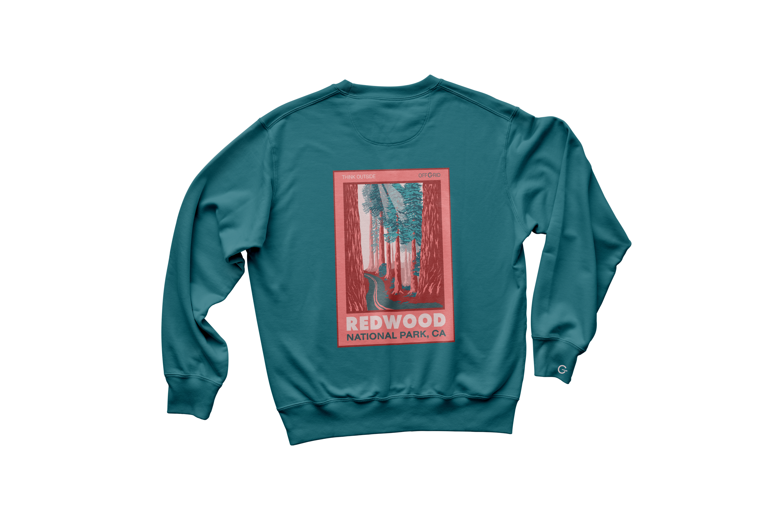
Clothing
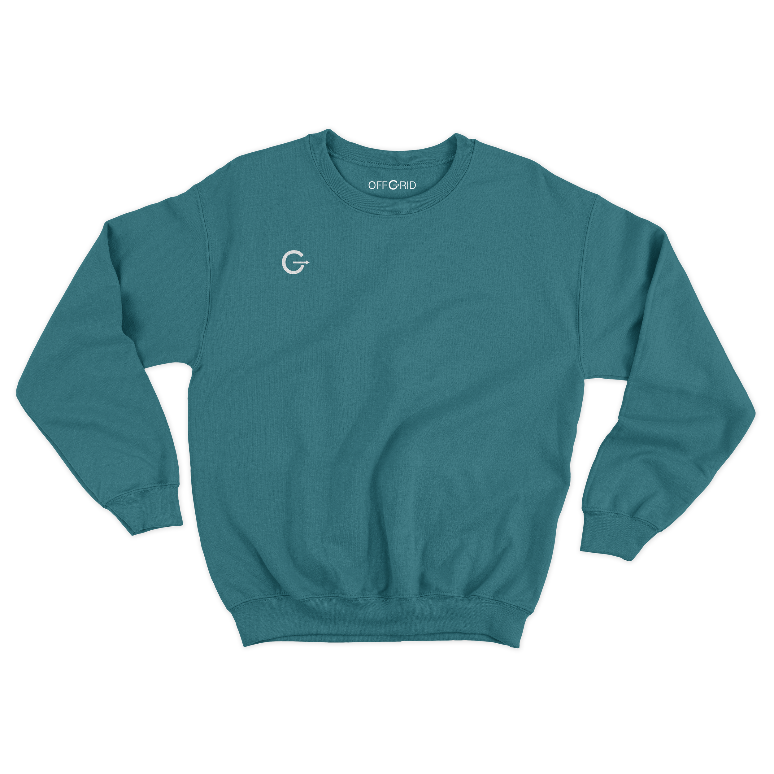
Merchandise was created for the Offgrid brand, as classic crewnecks and beanies. I used adobe illustrator to create extra imagery for the brand, and used mockups in photoshop to show the colors and textures of the products.
The logo was included on the tags for each product, and the color palette was made to match the identity of the brand. Comfort colors and earth tones were a must, and multiple colors were added, so the customer could have unlimited options.
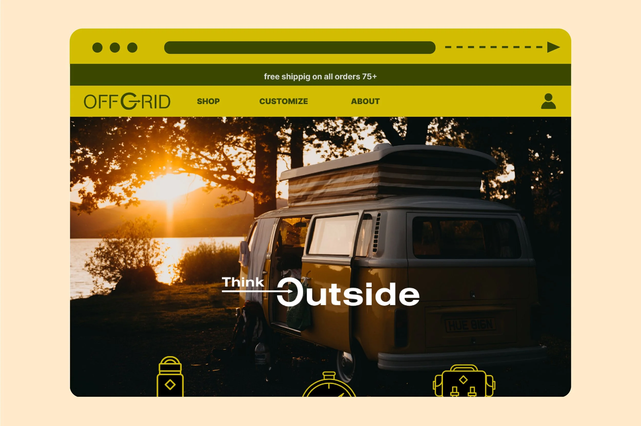
The Website
The website was the biggest deliverable of the entire project. I wanted to focus on web design layout, because I never had the opportunity to make a complete branded website from start to finish.
I wanted the website to be moody, and use bright colors and bold type. I focused mainly on imagery and my branding throughout the process. This included shots of the outdoors, and people camping, along with added icons and shoutouts for specific products.
Main Pages
The main pages included the homepage, an About page, and opening pages for products. I used bright photos and floating images for the bottles, to help advertise new products and grab the consumer’s attention. The products are then featured below, with the option to select them, the pricing, and the ability to add them to the bag.
Product Pages
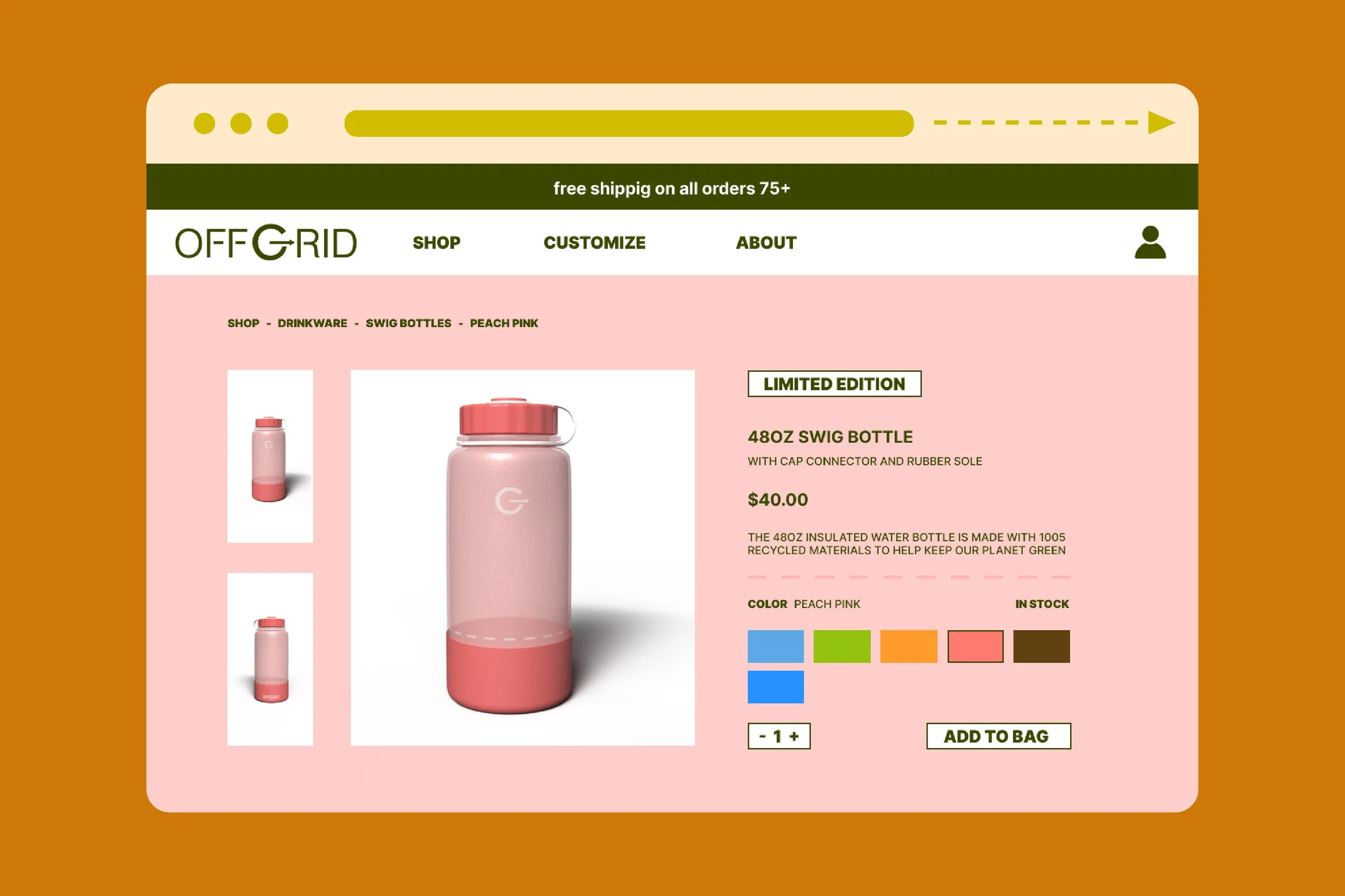
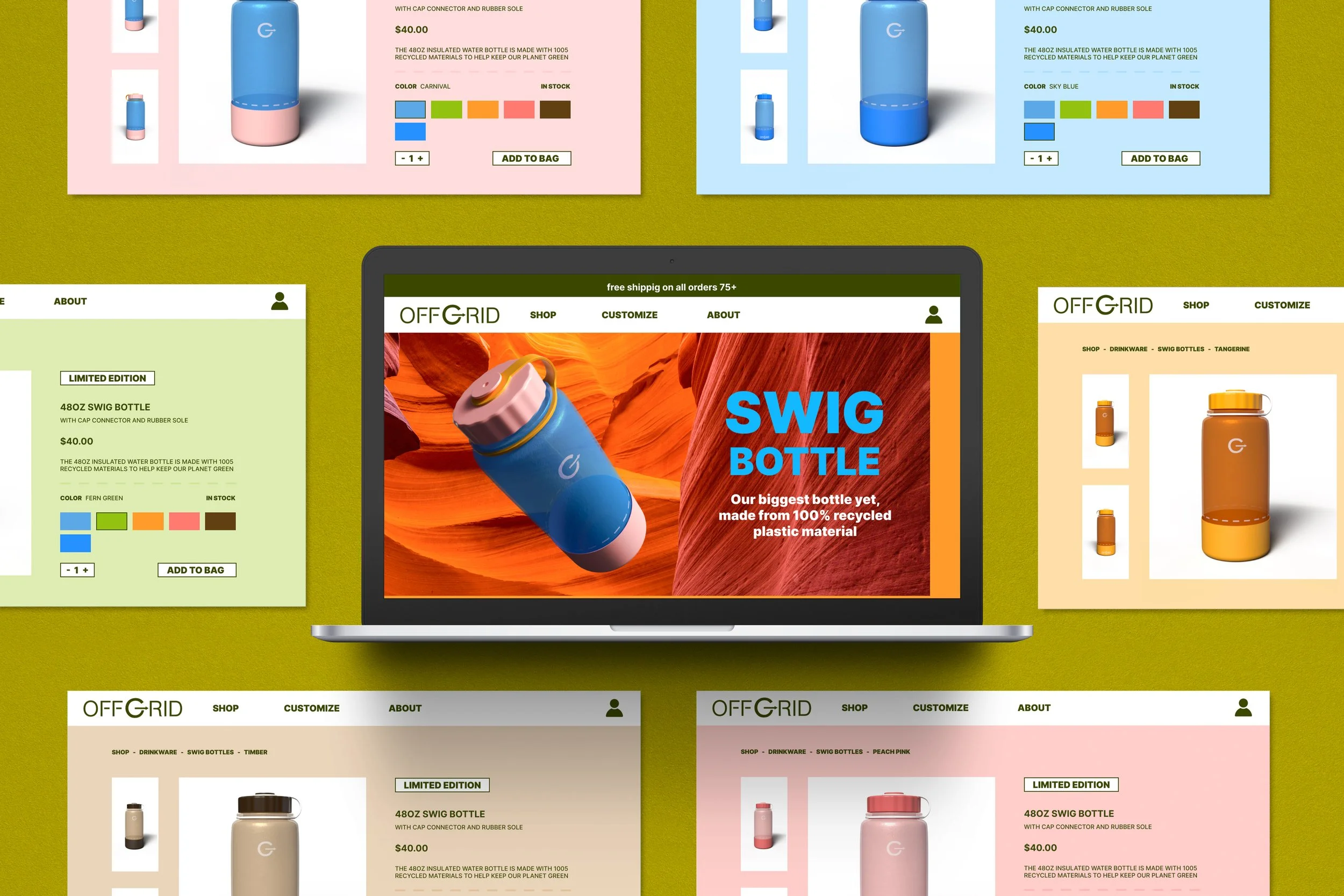
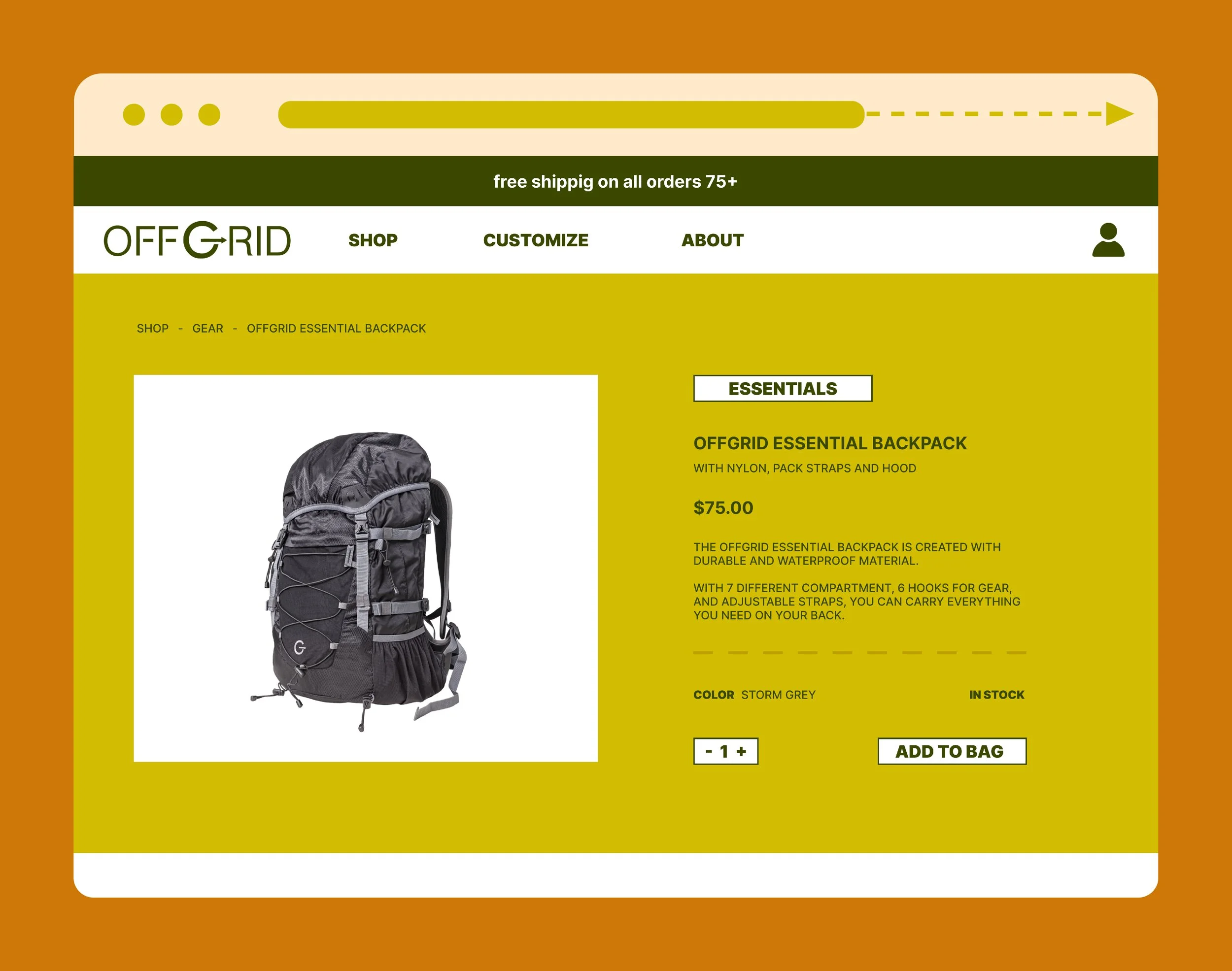
The product pages were created with unique colors for each page. Each bottle had a description, pricing, and color options to click between. They also included navigation to other bottles, and different pages, along with the options to add them to your bag.
I kept the type simple but focused on color to differentiate between the different bottle options. This was a way to show the bold colors that were being sold for the product.
Gear
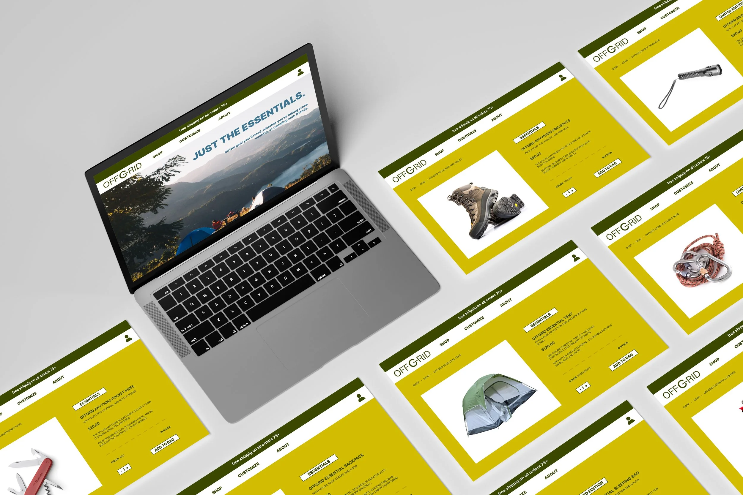
Gear was an important deliverable for the off grid outdoor brand. Instead of having multiple different options for shoes, socks, flashlights, etc. I felt it would be more efficient to have essential products you’d use for outdoor activities. I called these “The Essentials” and gave them a specific page on the website, where you can see all of the essential outdoor gear in one place. Each product also had its own page, with a description about it, along with pricing and color. This included products such as a sleeping bag, tent, pocket knife, backpack, and more featured below.

Environmental Advertisements
I focused on big callouts and bright colors throughout the outdoor brand. I knew this opened to opportunity for some really bold and eye-catching imagery in advertising. I focused on environmental advertisements and used billboards you’d see on the road or in cities and towns as a way to market the brand.
Instructor: Soonduk Krebs / Spring 2023 / Senior Graphic Design: Projects in Authorship